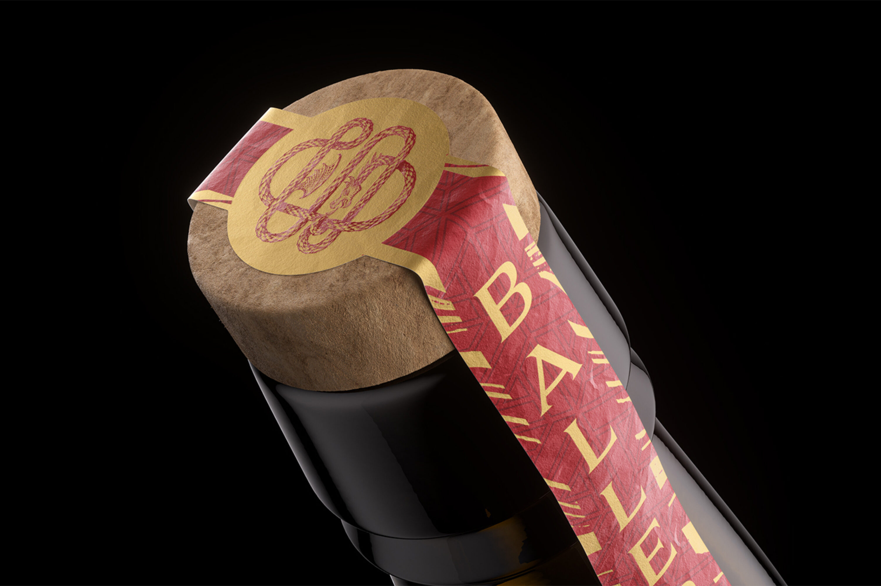
Baller American Single Malt Whiskey
Client
St. George Spirits
Almeda, CA
What we did
- Packaging Refresh
OVERVIEW
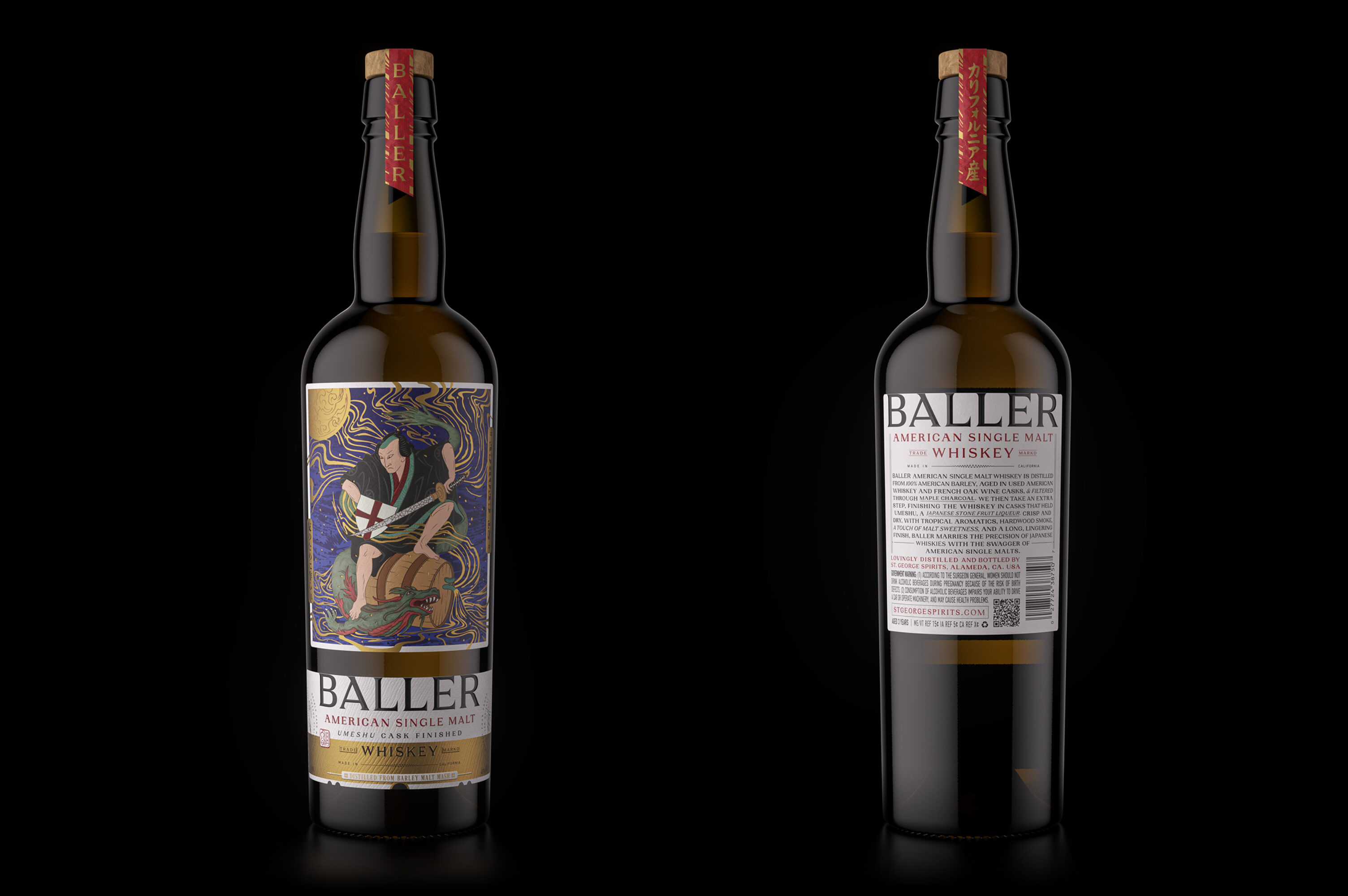
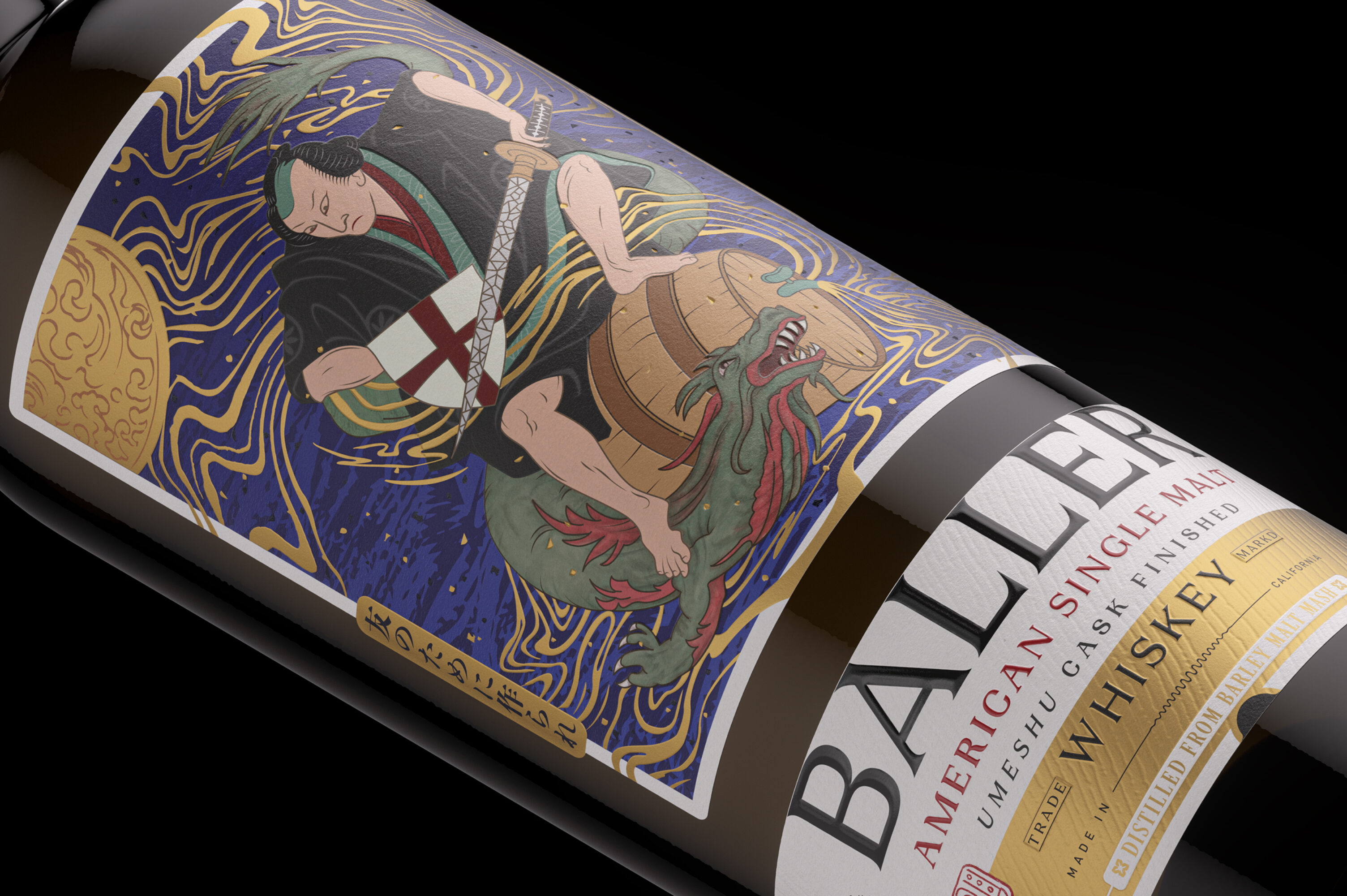
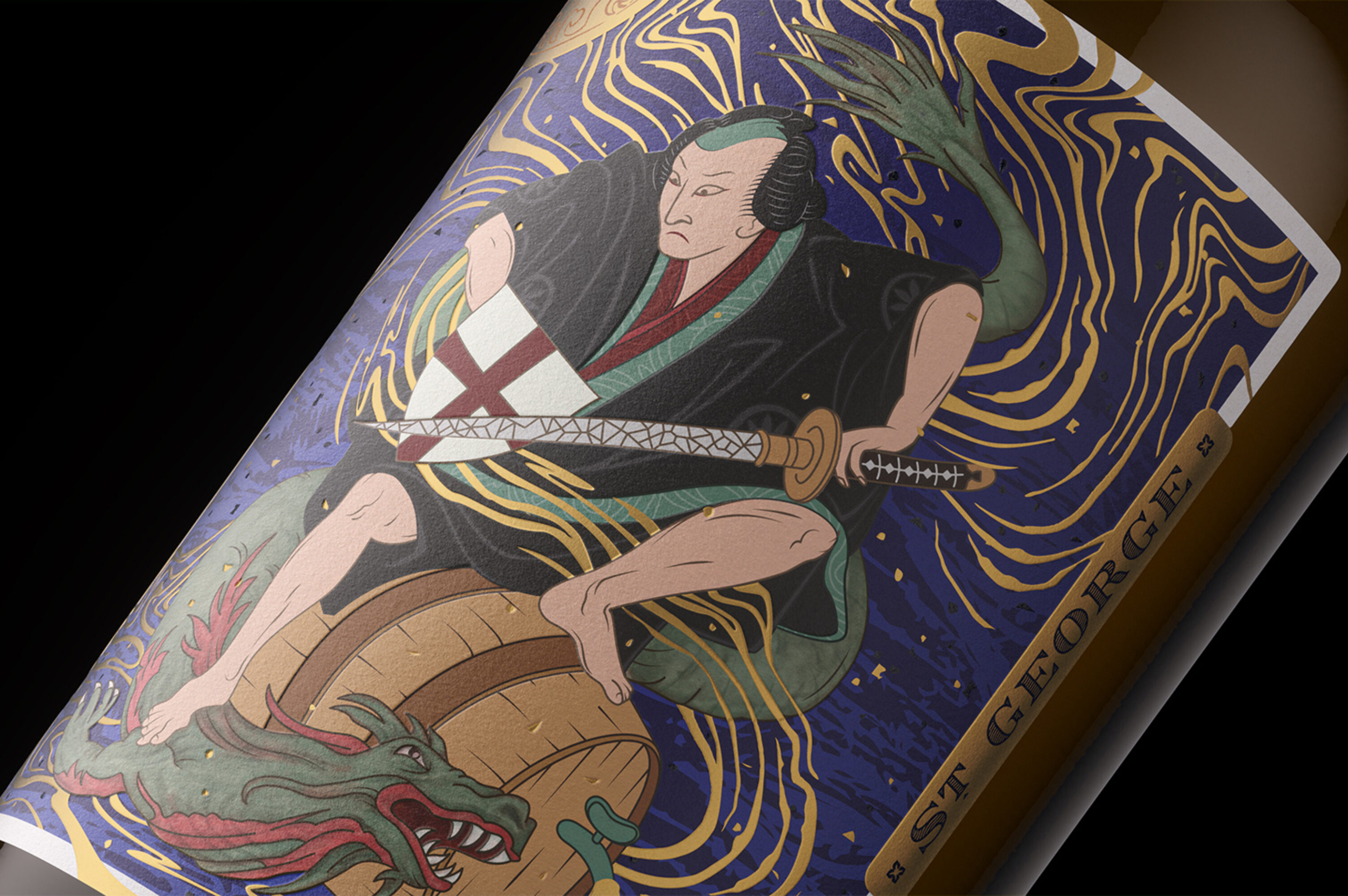
Baller has long-been a leader in the American Single Malt Whiskey category, but the original design didn’t resonate or highlight the vivid nature of this brand. Brought in to refresh the packaging, Thoroughbred completely remastered the original design to share a richer and more effective story with the consumer, inspired by the vibrant infusion of American and Japanese Single Malt Whiskey heritage.
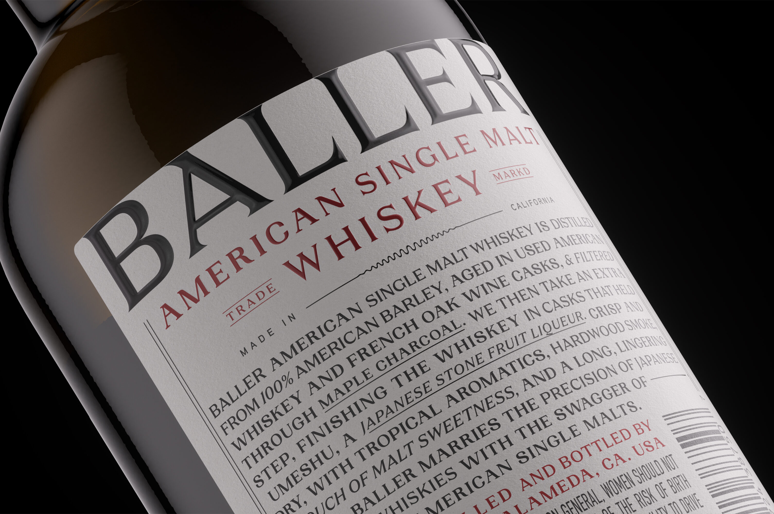
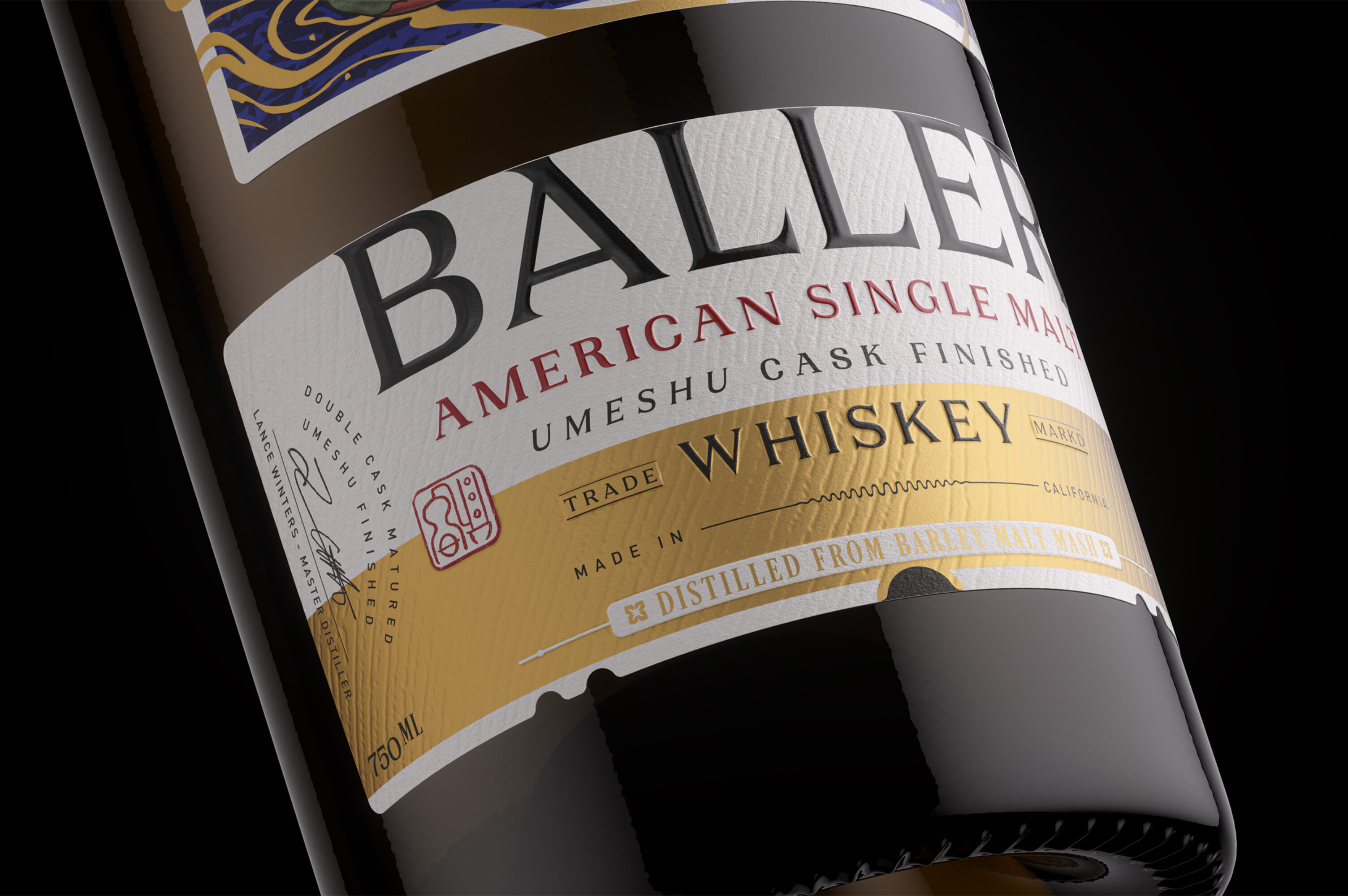
This is Baller reborn. Reframing the product to strengthen the identity of Baller as a single malt whiskey, this redesign provides a clear hierarchy and features bold typography which emphasizes the brand position as well as an enhanced product description on the back label. Adding in movement and gilded elements to the central illustration provides an engaging focal point, alluding to the richness of the spirit contained only by the bottle.
Unique to this design
Golden embellishments convey the sense one has found a prized bottle
Semi-custom bottle enhances premium cues
Enhanced readability clarifies the consumer experience
