Catoctin Creek Distilling
Client
Catoctin Creek Distilling
Purcellville, VA
What we did
- Packaging Design
- Packaging Refresh
Overview
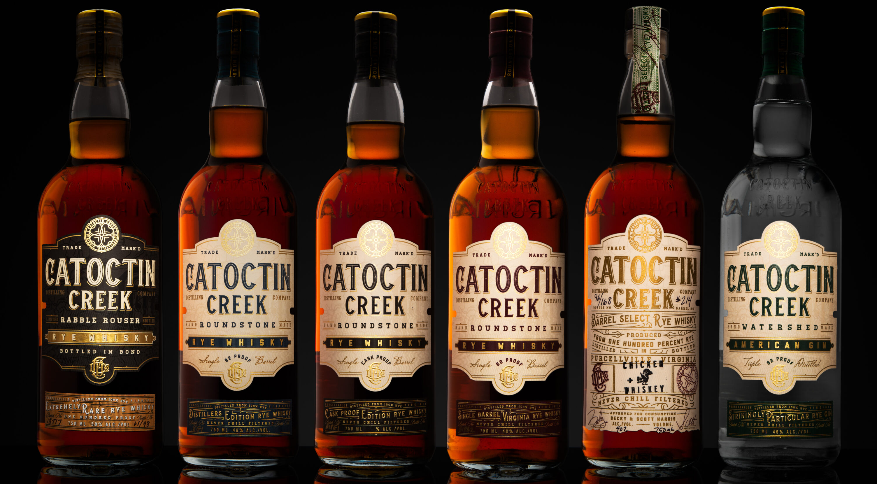
Originally organized as a house of brands, our endeavor with Catoctin Creek Distilling was to unify their products under one brand.
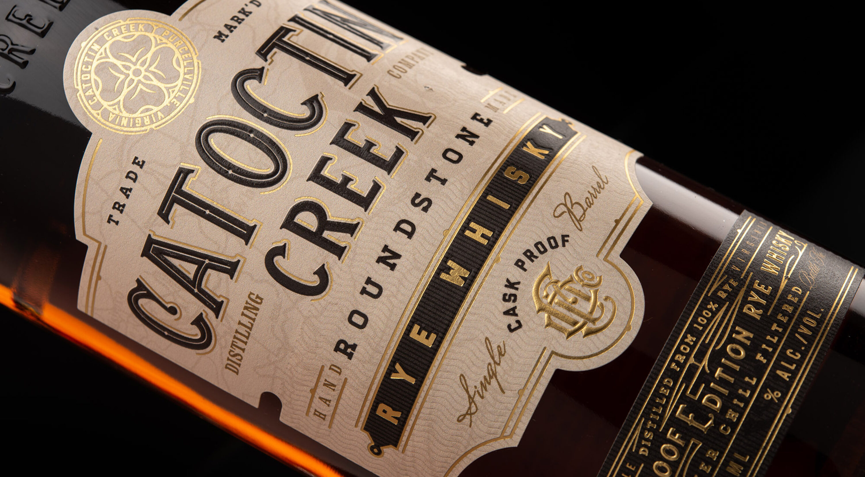
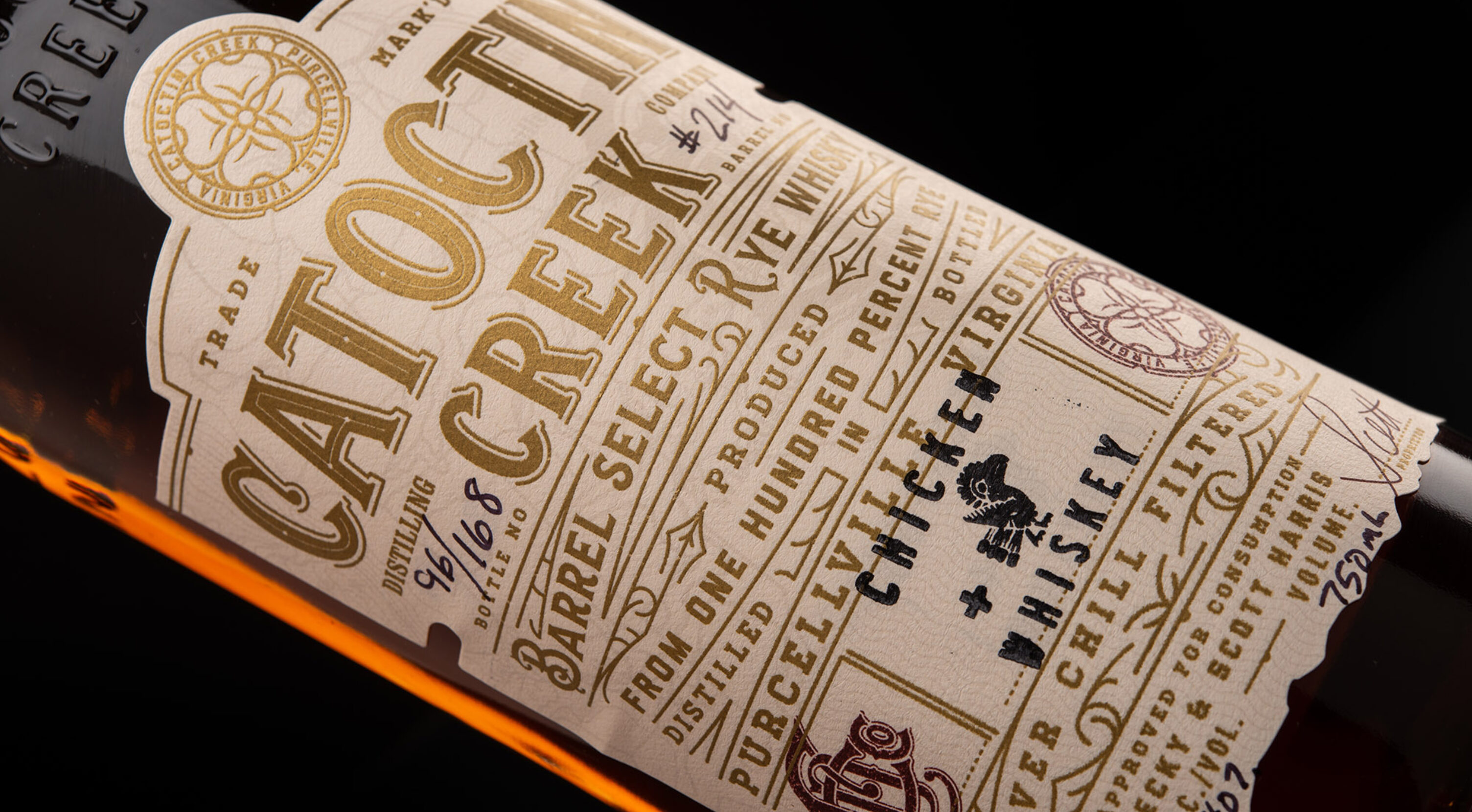
Catoctin Creek Distilling is one of the premier rye houses in America, and its label needed to reflect the high quality of the spirit without losing touch with their heritage.
This package design balances esteem with approachability. The various layers of their design honor the various aspects of their story.
Unique to this Brand
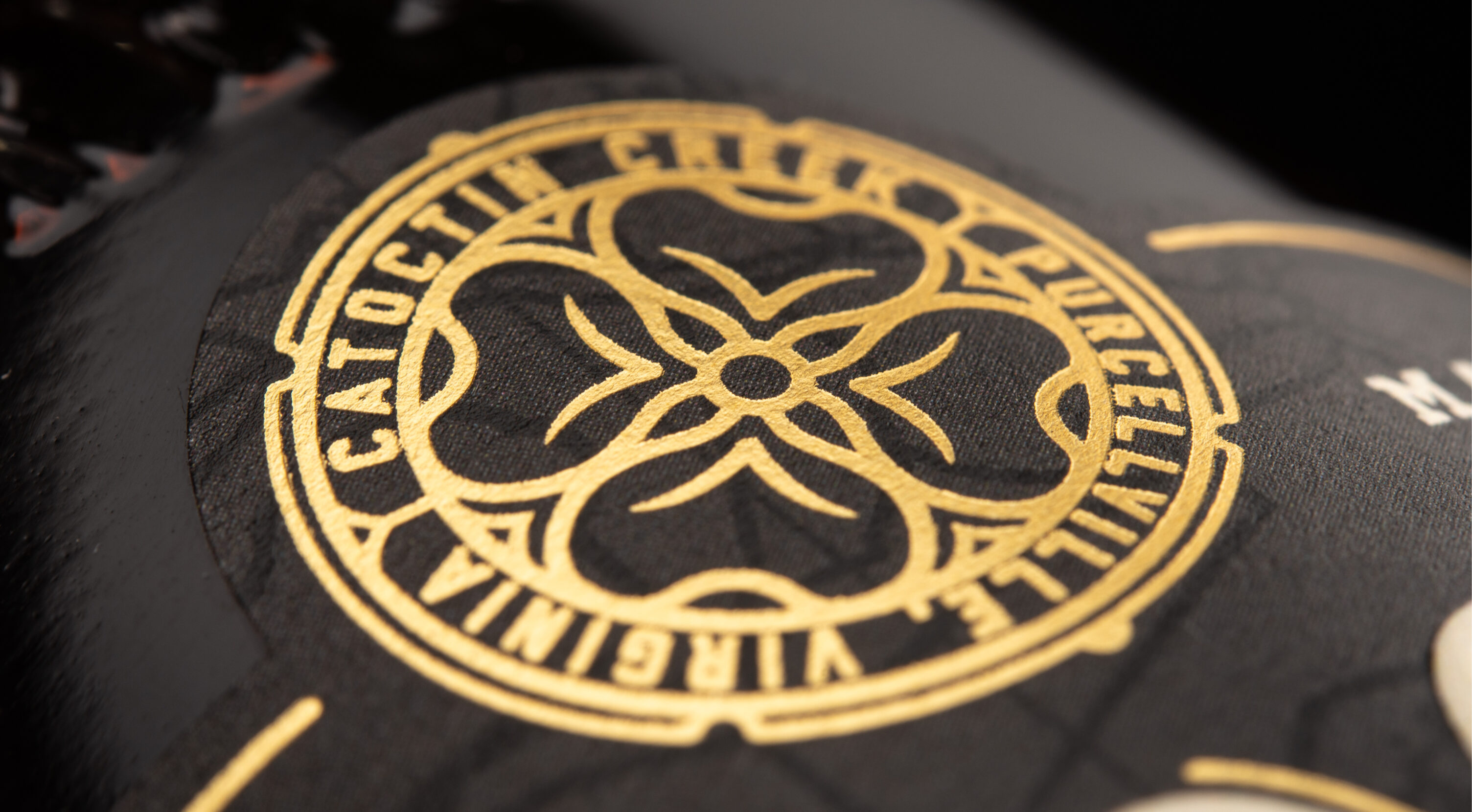
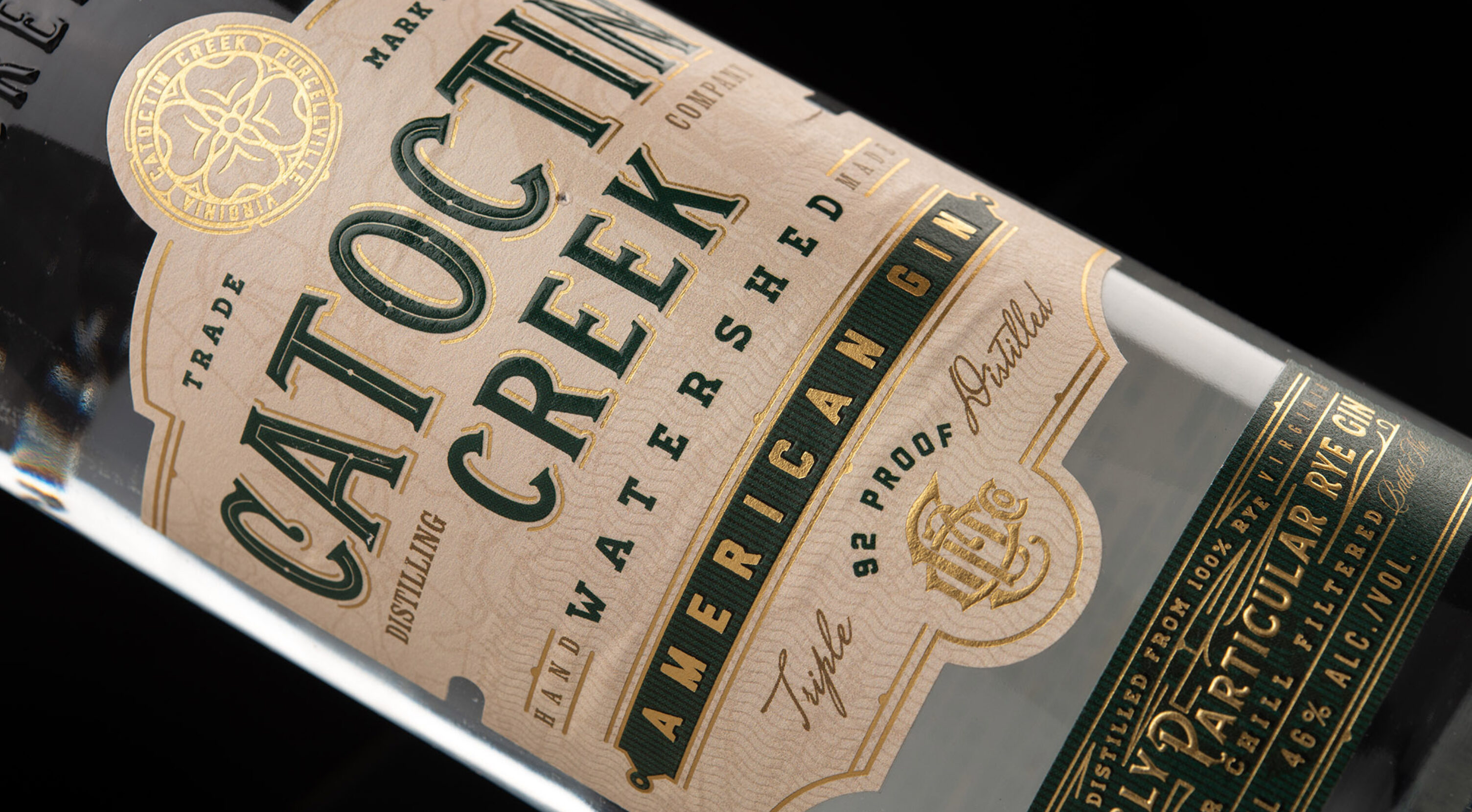
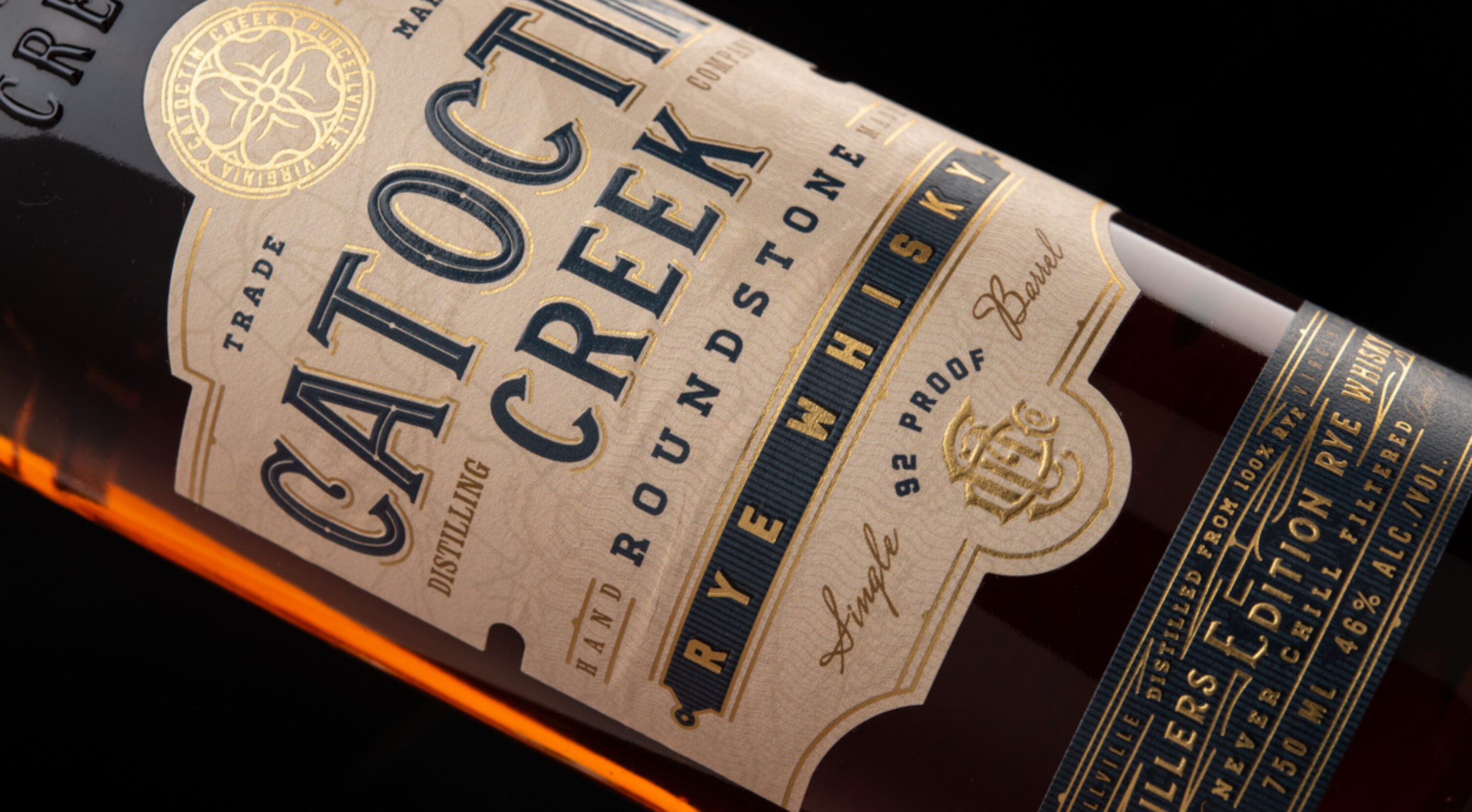
- Logo design - A roundel logo centers around a blooming dogwood flower, representative of the state of Virginia
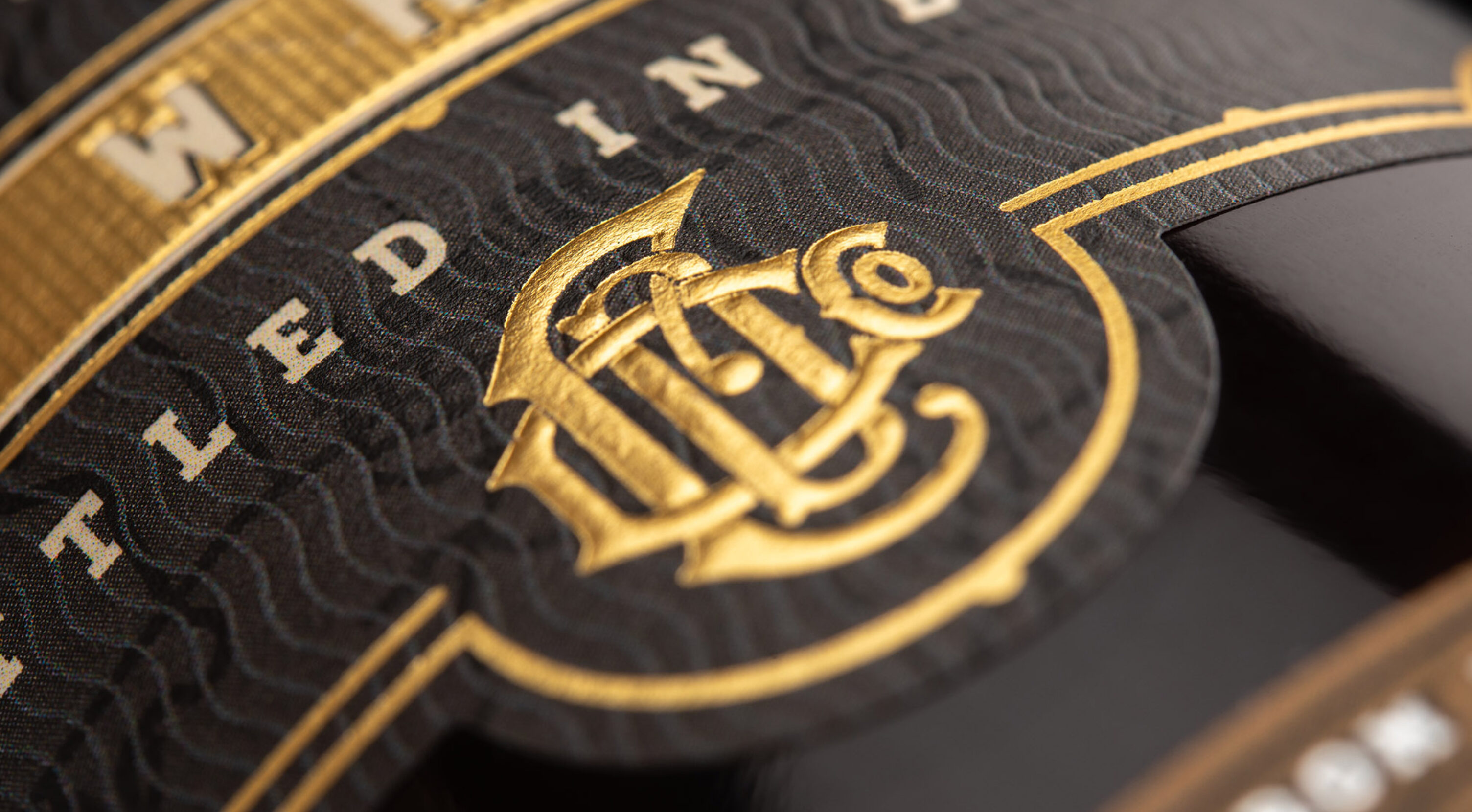
- Brand monogram - An entwined monogram design incorporates the initials of the distillery in a clever and compact fashion, translating well to supporting merchandise
- Embossed semi-custom bottle - The name of the distillery is adorned across the front of the glass bottle
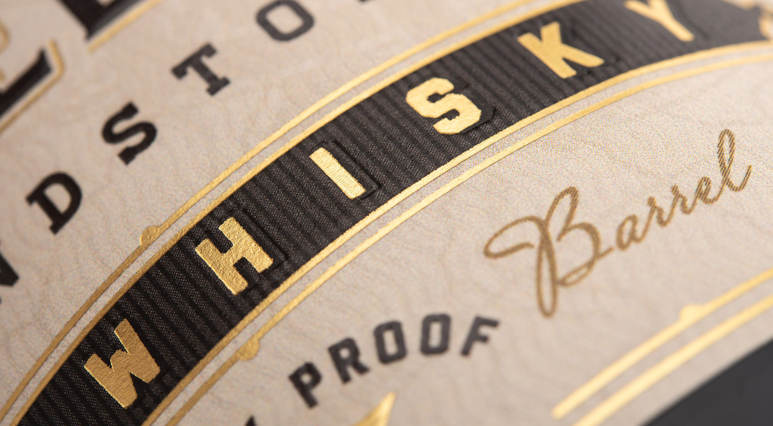
- Layered print finishes - Label includes foiling, embossing, and blind embossing for added texture and impact
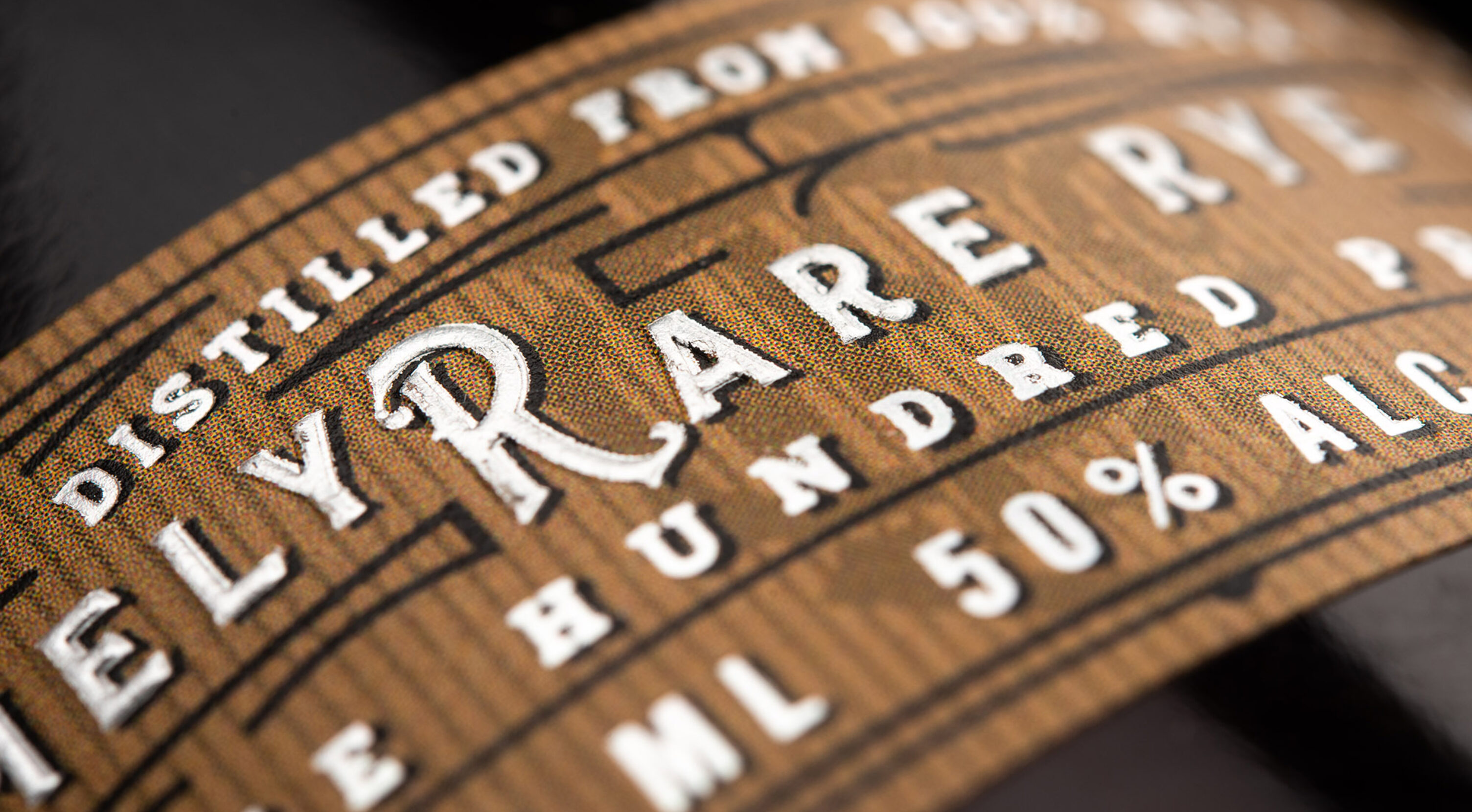
- Footer label - In addition to providing information about the spirit, the footer labels further the separation of product lines through supporting color identification while still keeping the main logo area clean and easy-to-read
